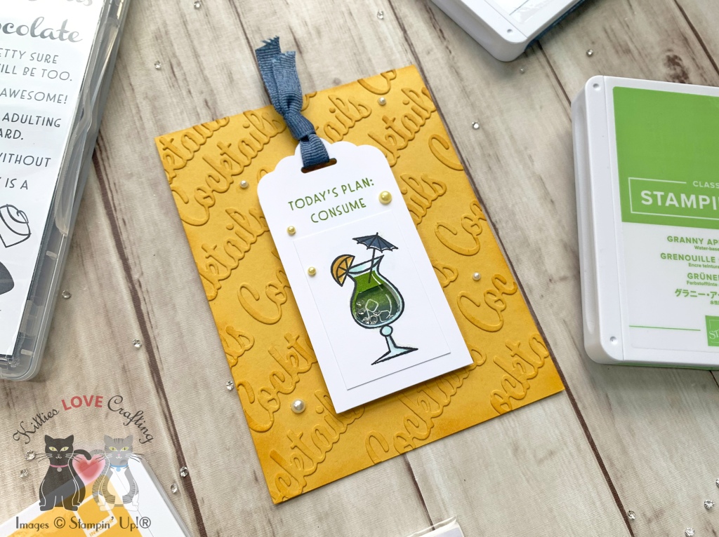
Hello friends. This faux embossed technique that I discovered a few years ago and is a great way to add dimension to your card without having to emboss. It can be done with most images and all text. I used the word dies from Nothing’s Better Than Bundle from Stampin’ Up! to create an embossed background. But to step it up I also decided to add a shaker element to the card.
Thanks for reading this post. I hope you enjoyed and I’ve inspired you to try this fun summery card for yourself! Leave comments or questions below or feel free to email me. If you want to share you creations with me tag me on instagram @kittieslovecrafting. If you would like a Stampin’ Up! catalog, please email me as well. All current catalogs can be found on the right side of this post and the Stampin’ Up! page. All news and fun stuff happening at Stampin’ Up! are listed there!
Well I’m sure you have heard of Christmas in July, but have you heard of Halloween in July??? Quite frankly, I love making Halloween cards anytime of year! It’s my favorite holiday ever!!!
I used 0 and C1, Y02 and Y06, YR12 and YR16 for the candy corn, YR16 and YR09, YG01 and YG25 for the pumpkins, Y02 and YR12 for the pumpkin guts, BV11 and BV17 for the scoop, C1 and C3, N5 and N7 for the knife and W1, W3, and W5, E15, E23, and E37 for the squirrels. I diecut the images and adhered them to their respective panels and adhered those to the back of the top panel. I used Stampin’ Dimesionals to adhere some of the images and then to the card base. Then I adhered the rest of the images around the panel.
Thanks for reading this post. I hope you enjoyed and I’ve inspired you to Shop Your Stash and see what fun ideas you come up with and maybe rediscover supplies you forgot you had! Leave comments or questions below or feel free to email me.
When I was going through my die stash I remembered how much I loved my Reveal Wheel dies from Lawn Fawn as well as the Lawn Fawn How You Bean? Stamp sets so I decided to combine them and see what happens. After all fish fit in a mason jar right?? (I probably wouldn’t put real fish in the mason jar but it’s fine for fake fish!)
I inked up the panel using MFT’s Snow Drifts Coverup Die (not available) as a stencil ccombined with Salty Ocean and Mermaid Lagoon, Mowed Lawn and Tumbled Glass Distress Oxide Ink. I created a gradient using Salty Ocean and Mermaid Lagoon first, then turned the die 180 degrees and used Mowed Lawn to layer over it, and finally Tumbled Glass over all of it to mute it some. I used the same color combo on the large wheel, without the stencil. I sprayed some water on everything with my RANGER Tim Holtz DISTRESS SPRAYER and blotted it.
I colored the images with COPIC markers. I used Y06, Y15 and YR04 for the goldfish, E53, E33, and E37 for the sandcastle, B95 and 97 for the shark, YG25 and YG03 for the plants, R05, R14, R17 and R27 for the crab, R05 and R12 for the coral, Y06, Y15, B24 and B26 for the striped fish and E53 and E33 for the sand in the jar tank.
Thanks for reading this post. I hope you enjoyed and I’ve inspired you to Shop Your Stash and see what fun ideas you come up with and maybe rediscover supplies you forgot you had! Leave comments or questions below or feel free to email me.
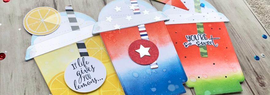
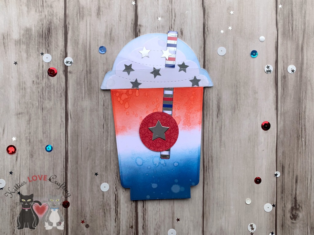
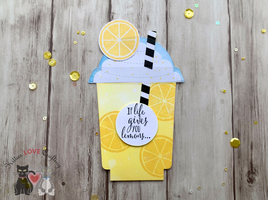
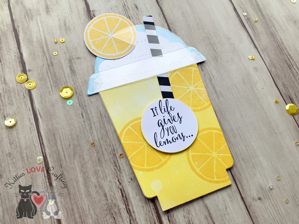
While it’s probably no surprise too many that I love coffee, I love coffee stamps and dies even more. This Honeybee Stamps Frappe Shake Card Dieset as well as their Honey Bee COFFEE CUP CARD Dies are my favorites! They have everything you need to make cute coffee cup and frappe cup shaped cards and shakers. And they fit in an A2 size envelope which is great!
I thought it would be fun to reuse this dieset to make some non-coffee cards, instead make brightly colored summer beverages. I don’t know if you all remember the rocket bomb popsicles that were red, white and blue. I remember many summers as a kid eating those popsicles (they were refreshing and turned my tongue red or blue, depending on which end I ate first—what could be better??). LOL That was the inspiration for my first card.
I started by diecutting card bases using the large card, coffee cup, and the whipped cream dies in the set from Neenah 110lb Classic Crest Cardstock 8.5 X 11″ 3 times. I also diecut 3 sets of the lid and its rim from Acetate.
On the inside of the card, I stamped “Happy 4th of July” with a very old stampset I had (sorry don’t know where it came from) using Tim Holtz Chipped Sapphire Distress Oxide Ink and added 3 silver stars.
Card Inside
For the second card, I decided to make a delicious watermelon smoothie. Who doesn’t like a tasty frozen watermelon beverage on a hot summer day?!? I’m now craving a smoothie while writing this post. LOL.
Thanks for reading this post. I hope you enjoyed and I’ve inspired you to Shop Your Stash and see what fun ideas you come up with and maybe rediscover supplies you forgot you had! Leave comments or questions below or feel free to email me.
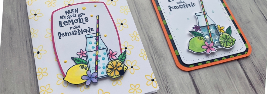
Hello friends. Hope you are all safe and healthy. And if you are struggling to cope with everything going on in our world right now, hang in there because ‘this too shall pass’. Speaking of old adages, “When Life Gives You Lemons Make Lemonade” is very fitting for these times we are in as well. While it’s very easy to focus on the scary and sad stuff going on, we have to find the bright spots too — the healthcare workers saving lives, families coming together, babies being born, spending time with our pets (one of my faves right now)…
These bright and cheerful cards were made using the Catherine Pooler Designs Make Lemonade Stampset (Out of stock-maybe discontinued). It was a limited release in March, I believe. It’s a tiny stampset but was super fun to color. I made one of them into a shaker (a tiny shaker:)).
Next, I colored the image with COPICS. I used BG000 + 0 for the bottle; Y11 +Y06 + Y13 for the lemons; Y11 +Y06 + Y13 + Y15 for the sliced lemon; YG06 + YG07 for the leaves; RV09 and Y06 + Y15 for the straw; RV10 + RV11 + RV14 for the flowers. I stamped the bubbles with Catherine Pooler Designs It’s A Boy Ink. I fussycut the image out.
I stamped the image onto a scrap of Neenah 110lb Classic Crest Cardstock with Memento Tuxedo Black Ink and set it aside to dry. I colored it with COPICS. I used Y13 + YG03 + YG01 + YG25 for the lime on the left; B0000 + 0 for the bottle; YR16 + YR18 and YG03 + YG25 for the straw; Y06 + Y18, R81 + R85, and V25 + BV17 for the flowers; and YG06 + G07 for the leaves .
Hello friends. Hope you are all safe and healthy. And if you are struggling to cope with everything going on in our world right now, hang in there because ‘this too shall pass’. Speaking of old adages, “When Life Gives You Lemons Make Lemonade” is very fitting for these times we are in as well. While it’s very easy to focus on the scary and sad stuff going on, we have to find the bright spots too — the healthcare workers saving lives, families coming together, babies being born, spending time with our pets (one of my faves right now)…
These bright and cheerful cards were made using the Catherine Pooler Designs Make Lemonade Stampset (Out of stock-maybe discontinued). It was a limited release in March, I believe. It’s a tiny stampset but was super fun to color. I made one of them into a shaker (a tiny shaker:)).
Next, I colored the image with COPICS. I used BG000 + 0 for the bottle; Y11 +Y06 + Y13 for the lemons; Y11 +Y06 + Y13 + Y15 for the sliced lemon; YG06 + YG07 for the leaves; RV09 and Y06 + Y15 for the straw; RV10 + RV11 + RV14 for the flowers. I stamped the bubbles with Catherine Pooler Designs It’s A Boy Ink. I fussycut the image out.
I added a piece of acetate behind the shaker window in the bottle, some 3M Foam Tape, and some flat clear sequins from my stash added it to the card. I finished it off by adding some Nuvo Sea Breeze Jewel Drops around the card.
On the inside of the card, I cut out a panel of Neenah 110lb Classic Crest Cardstock 8.5 X 11″ to 3-1/2″ x 4-3/4″ and a left over piece of the pattern paper to 3/4 x 3-1/2″ and adhered it to the bottom of the panel, then rounded the corners before adhereing it to the card base.
Thanks for reading this post. I hope you enjoyed and I’ve inspired you to give these cards a try for yourself. Leave comments or questions below or feel free to email.
Hello friends. I would like to talk to you all about pattern paper and cardstock today. Most of us have a ton of it, some of us use it and some of us hoard it (Guilty as charged. LOL) Sometimes we have pattern papers that have images on them but no coordinating stamps (either you didn’t purchase them or the manufacturer didn’t create a coordinating stampset). These two paper packs from Brutus Monroe were part of their June release. Very fruity and summery but there is no coordinating stamps. I have several fruity stamp sets that will work with this paper but I know that many other people may not.
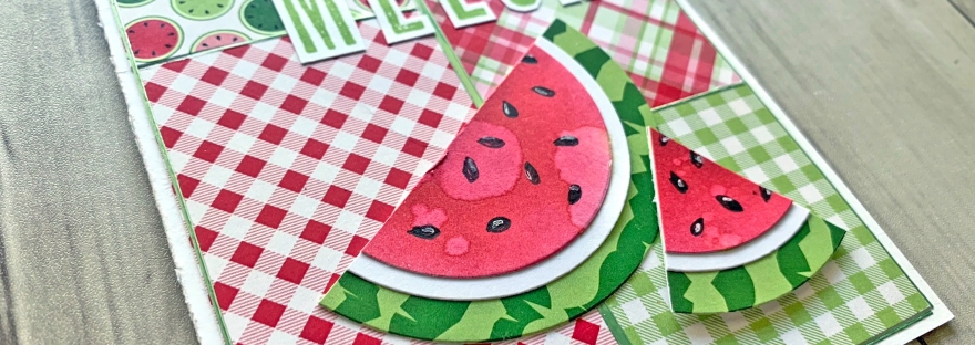
So I decided to challenge myself to make cards with just the paper and some sentiments from my stash. Since it’s still summer I decided to use fruity paper. Fruit is a delicious summer treat!
Ok, time to work on the background. I chose 4 pattern papers from the pack, cut one to 1/2 x 2-1/4″, one to 2 x 3-1/4″, one to 2 x 3-7/16″ and the last one to 2 x 2″. I adhered them on the white card base as per the below sketch. If you want a gap between your rectangles cut them down to 1/16th smaller on each side. I added a strip of the thicker width Pin Stripe Peel-Off Stickers – Apple Green by Love From Lizi vertically in the center, then the narrowest width strips to the outer edges and in between the panels horizontally.
I laid out my sentiments and watermelon pieces onto my card to figure out placement. Once I was happy with it, I adhered all the pieces down, popping up one watermelon slice with Stampin’ Dimensionals by Stampin’ Up! . To finish this card, i added some Tonic Nuvo Drops in BOTTLE GREEN.
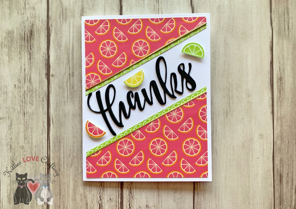
I had so much fun playing with these papers from Brutus Monroe that I decided to make another card.
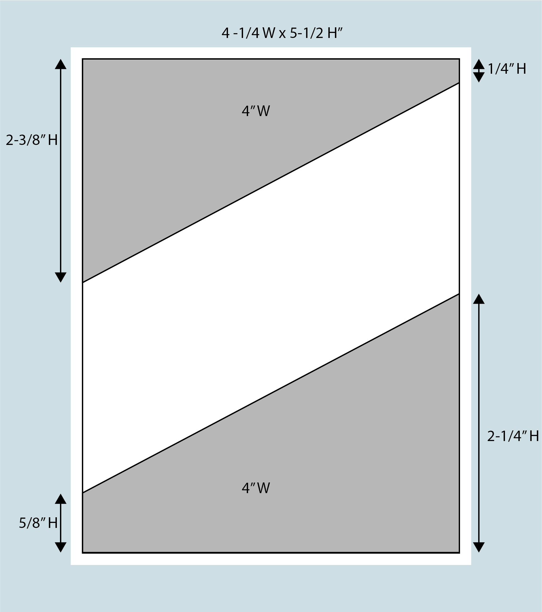
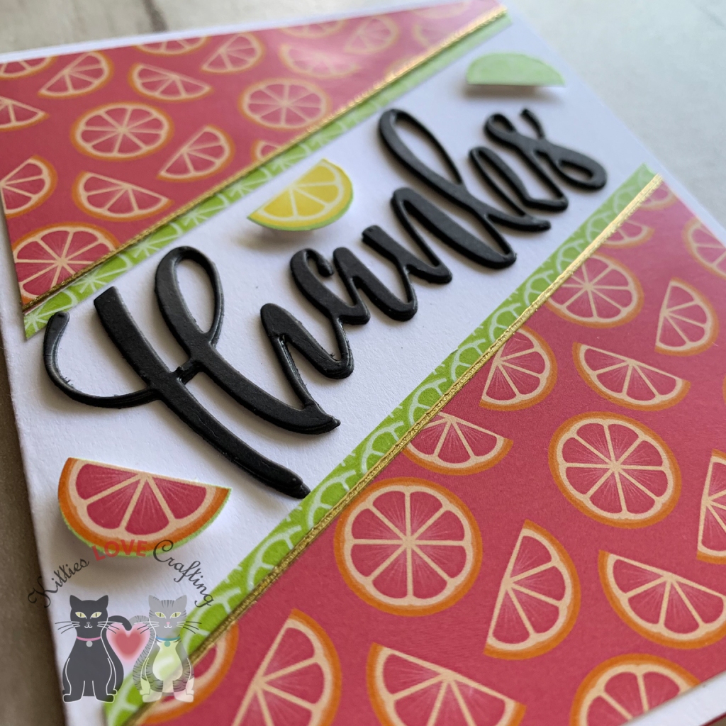
The second card came together quickly. I started with a white card base measuring 5-1/2 x 8-1/2″, scoring it at 4 1/2″. This was made from Neenah 110lb Classic Crest Cardstock 8.5″X11″. Next, I cut some of the pattern paper down to 4 x 5-1/4″ and cut that down diagonally as per the below sketch. I did the same thing to a second pattern paper (green one) and adhered that behind the top layer, offsetting it a bit to create a border. I added a strip of the thinner width Love From Lizi Pin Stripe Peel-Off Stickers in Gold Glitter between the two pattern papers and adhered them to my card base, leaving a 1/8 border around the edge.
Thanks Card Sketch
For the sentiment, I kept thing simple. I used the Large Thanks Die from Honey Bee Stamps and diecut the word 3 times from Simon Says Stamp Card Stock 100# BLACK Cardstock. I layered those 3 together and adhered them, creating a nice thick 3D sentiment. I adhered those to the card in the center of the white space. I felt like something was missing though. I took another pattern paper that had small lemons, limes and oranges (maybe grapefruit? not sure) and using a 1/2 punch I cut 3 of them out and adhered them on my page. That completed the front of this card! Like I said, this one was a quick one.
But just because I hate an empty card inside, I adhered some of the same pattern paper I used on the front diagonally to the inside bottom right corner. And now its complete!

 https://linkdeli.com/widget.js?id=f5e8378456858c916708