Hello friends. It’s time to create some Christmas cards! It’s never too early to start. I decided to try making some very easy watercolored cards using older products I already have. These cards can easily be mass-produced which was my objective. I used all watercolor backgrounds but stepped up a few with embossing folders. It takes very little effort but produces great results!!!
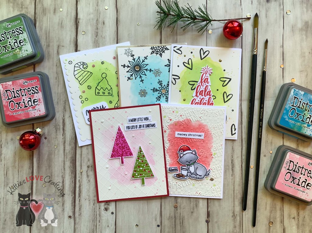
I started these cards by choosing some inks for the backgrounds. I used Tim Holtz Kitsch Flamingo, Festive Berries, Twisted Citron, Mowed Lawn, and Mermaid Lagoon Distress Oxide Inks. I also cut 5 pieces of Strathmore 300 Series Smooth Bristol Paper to 4-3/4 x 5-1/4″. I added splatters to all the panels with the same ink and then on the green panel I also used Gold Acrylic Paint for splatter and the Silver Paint for the Mermaid Lagoon panel.
For the first card, I cut a piece of Neenah 100lb Classic Crest Cardstock 8.5 X 11″ to 5-1/2 x 8-1/2″ and scored at 4-1/4″ to create a card base. I die cut the background with the Catherine Pooler Designs Scallops & Dots Dies.

I stamped images from the Catherine Pooler Designs Nice List stamp set (discontinued) onto the card with Catherine Pooler Designs Midnight Ink. And a sentiment onto Neenah 100lb Classic Crest Cardstock 8.5 X 11″ with the same black ink.
I finished it off by adding Queen and Co Petite Posies in Purple.
I left the inside of the card blank
Dimensions
- Card Base = 5-1/2 x 8-1/2″ and scored at 4-1/4″ Neenah 100lb Classic Crest Cardstock 8.5 X 11″
- Top Panel = 4-3/4 x 5-1/4″ Strathmore 300 Series Smooth Bristol Paper

For the second card, I cut a piece of Neenah 100lb Classic Crest Cardstock 8.5 X 11″ to 4-1/2 x 11″ and scored at 5-1/2″ to create a card base. I cut a piece of Tim Holtz Idea-ology 8 x 8 METALLIC KRAFT STOCK Paper to 4 x 5-1/4″. I stamped snowflakes from Catherine Pooler Designs Joyful Flakes (unavailable) with Catherine Pooler Designs Midnight Ink, and Versamark Ink and Ranger Silver Embossing Powder.

I stamped the sentiment from the same stamp set with the silver embossing powder as well. I finished the card by adding some flat silver sequins from my stash.
Dimensions
- Card Base = 4-1/2 x 11″ and scored at 5-1/2″ Neenah 100lb Classic Crest Cardstock 8.5 X 11″
- Top Panel = 4-3/4 x 5-1/4″ Strathmore 300 Series Smooth Bristol Paper; 4 x 5-1/4″ Tim Holtz Idea-ology 8 x 8 METALLIC KRAFT STOCK Paper
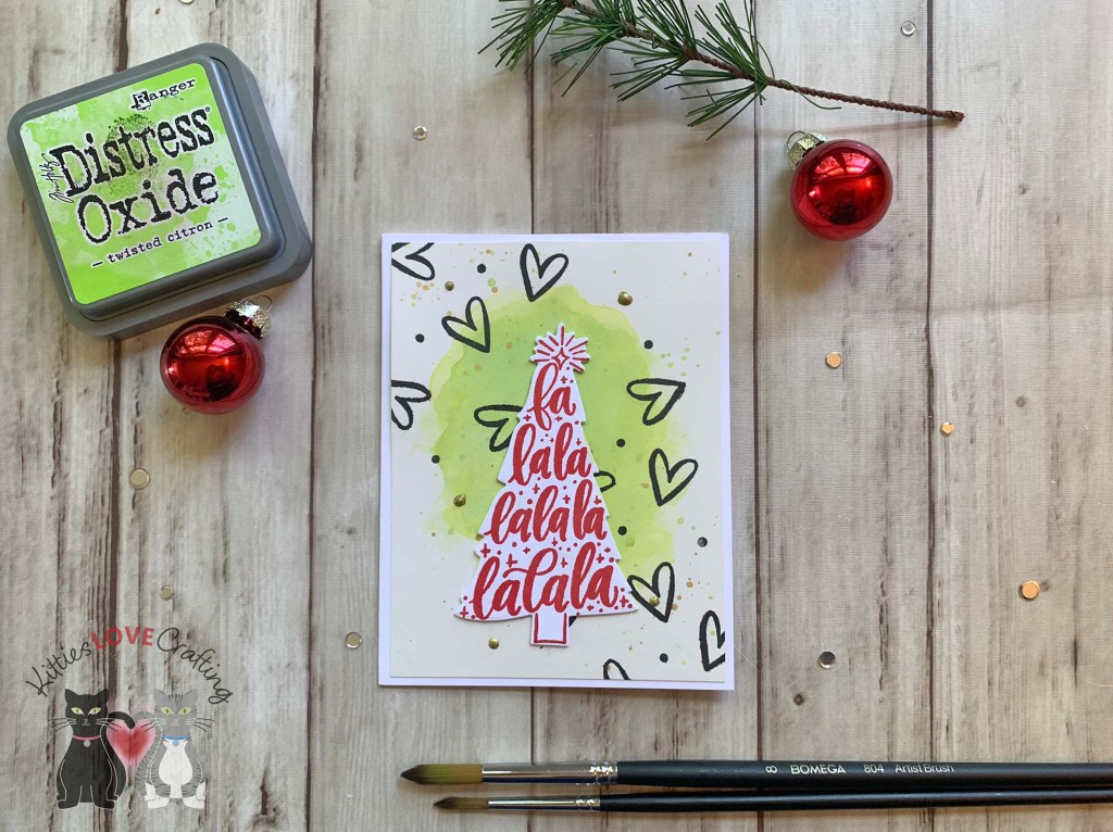
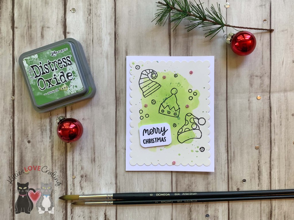
For the third card, I cut a piece of Neenah 100lb Classic Crest Cardstock 8.5 X 11″ to 5-1/2 x 8-1/2″ and scored at 4-1/4″ to create a card base. I stamped hearts onto the background from Catherine Pooler Designs Caroling Sentiments with Catherine Pooler Designs Midnight Ink. Then stamped the tree sentiment from the same set onto Neenah 100lb Classic Crest Cardstock 8.5 X 11″ with Rockin’ Red Ink and die cut it with the coordinating dies.
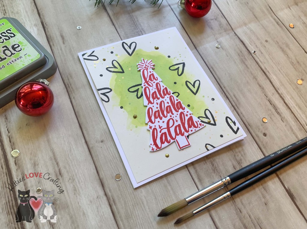
I finished it off by adding Nuvo Crystal Drops in Metallic Bright Gold.
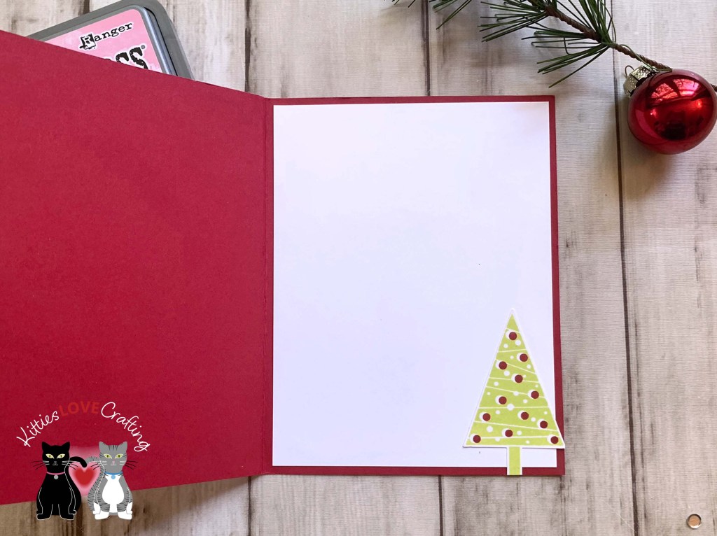
On the inside of the card, I stamped a sentiment from Catherine Pooler Designs Wrapped and Ready Stamp Set with Tim Holtz Mowed Lawn Distress Oxide Ink.

Dimensions
- Card Base = 5-1/2 x 8-1/2″ and scored at 4-1/4″ Neenah 100lb Classic Crest Cardstock 8.5 X 11″
- Top Panel = 4-3/4 x 5-1/4″ Strathmore 300 Series Smooth Bristol Paper

For the fourth card, I cut a piece of Stampin’ Up! Real Red 8-1/2″ X 11″ Cardstock to 5-1/2 x 8-1/2″ and scored at 4-1/4″ to create a card base. I ran the watercolored panel through my die cut machine using the Darice Wired Fence Embossing Folder (unavailable).
I stamped the trees from Stampin’ Up! Festival of Trees Stampset (retired) onto Neenah 100lb Classic Crest Cardstock 8.5 X 11″ with Catherine Pooler Designs Pucker Up, Rockin’ Red, and Martini Inks. And used the coordinating punch to cut them out. I popped them up with 3M Foam Tape.

I stamped a sentiment from the same set onto Neenah 100lb Classic Crest Cardstock 8.5 X 11″ with Catherine Pooler Designs Midnight Ink. Then cut into strips.
I finished the card by adding some Fresh Snowfall Nuvo Glitter Accents.
On the inside of the card, I added another tree stamped with Catherine Pooler Designs Melon Ice Ink.
Dimensions
- Card Base = 5-1/4 x 10-1/2″ and scored at 5-1/4″ Stampin’ Up! Real Red 8-1/2″ X 11″ Cardstock
- Top Panel = 4-3/4 x 5-1/4″ Strathmore 300 Series Smooth Bristol Paper

For the last card, I cut a piece of Neenah 100lb Classic Crest Cardstock 8.5 X 11″ to 4-1/2 x 11″ and scored at 5-1/2″ to create a card base. I ran the watercolored panel through my die cut machine using the Embossalicious Christmas Merriment Embossing Folder (unavailable).

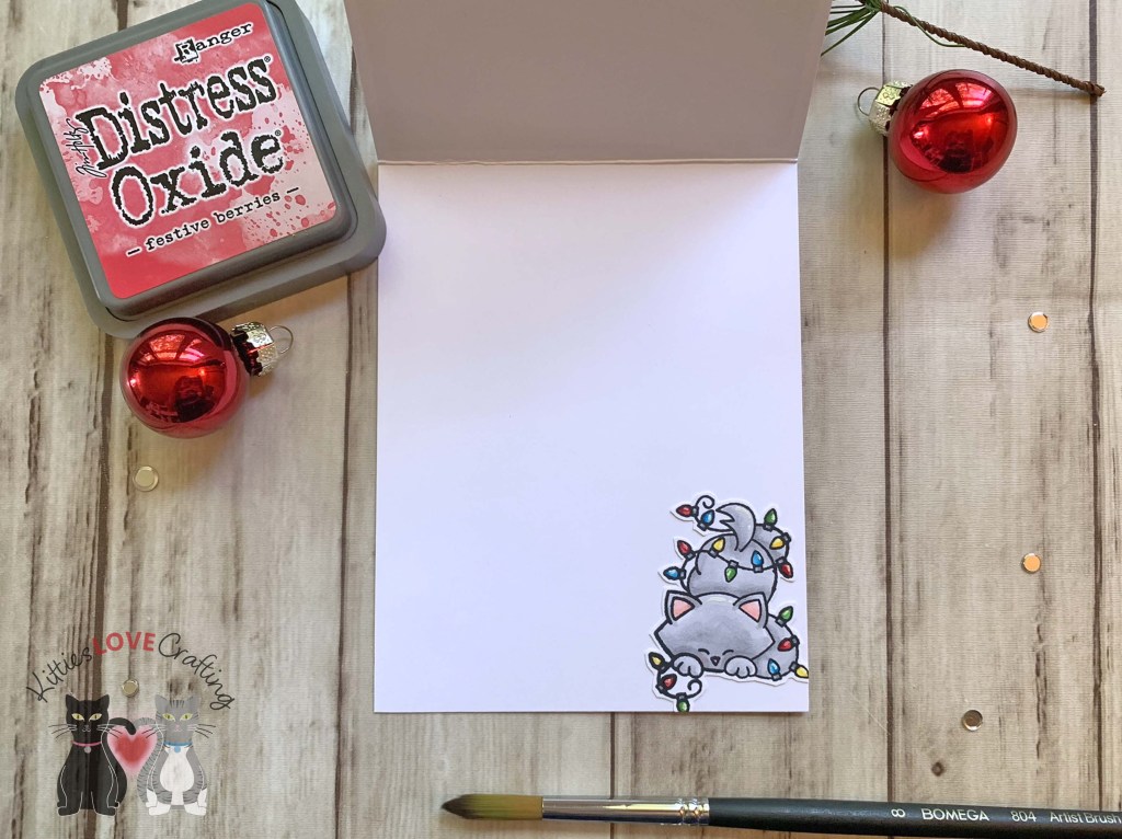
I stamped the kitty from Newton’s Nook Curoius Christmas (retired) onto Neenah 100lb Classic Crest Cardstock 8.5 X 11″ with Memento Tuxedo Black Ink. I used Copic Markers to color the images. I used R20, N0, N2, YG06 & YG17 for the cat; C1 & 0, R14, R27 and R29 for the hat; C1, B0000 and 0 for the milk and cup; E34 and E37 for the cookie; and C3, C5, YG06, YG17, R14, R29, B16, B12, Y02 and Y18. I fussycut the image and popped it up with some Stampin’ Dimensionals.
I stamped a sentiment from the same stamp set onto Neenah 100lb Classic Crest Cardstock 8.5 X 11″ with Memento Tuxedo Black Ink and trimmed it to 5/16 x 1-3/4″.
I finished the card by adding some Nuvo Jewel Drops in Key Lime.
On the inside of the card, I added another kitty image.
Dimensions
- Card Base = 4-1/2 x 11″ and scored at 5-1/2″ Neenah 100lb Classic Crest Cardstock 8.5 X 11″
- Top Panel = 4-3/4 x 5-1/4″ Strathmore 300 Series Smooth Bristol Paper
Supplies
 https://linkdeli.com/widget.js?id=f5e8378456858c916708
Thanks for reading this post. I hope I’ve inspired you to give this easy watercolor holiday cards a try for yourself. Leave comments or questions below or feel free to email.