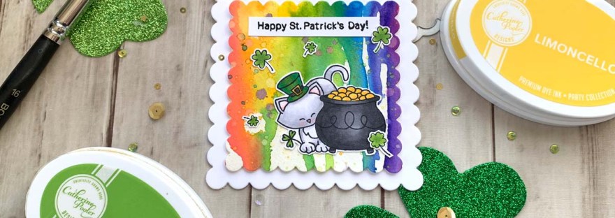
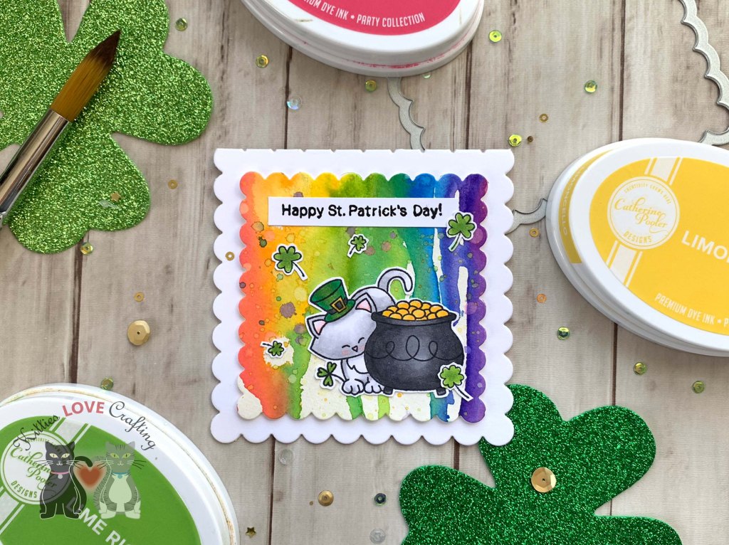
Hello friends. Need a quick card for St. Patrick’s Day?!? The watercolor background on this card is super quick to make and there’s no for perfection (which I love) necessary because it should look like paint was dropped on the paper.
I colored the images with Copic colors. I used N5 & N8 and Y15 & Y17 for the pot of gold; YG17, G07 & G09, N5 & N8 and Y15 & Y17 for Newton’s hat; N1, N2, 0 & R20 for Newton; and YG17, G07 & G09 for the shamrocks.
Thanks for reading this post. I hope you enjoyed and I’ve inspired you to give this card a try for yourself. Leave comments or questions below or feel free to email.
Hello friends. I had some fun playing with my distress inks and other products and created several backgrounds. Sometimes it’s nice just to play with mediums and not think too much. I love distress inks because they create cool effects when water or other mediums are combined with them. I ended up with 6 backgrounds I will later turn into cards. Stay tuned for that post…
For these backgrounds I decided to test out the reaction Distress Oxides and Distress Crayons had with water and also salt plus white vinegar. I also tested Cold Press Watercolor Paper and Strathmore Bristol Smooth Multimedia Paper. I was actually surprised at the reaction of the watercolor paper to the salt and vinegar.
I then used Abandoned Coral, Carved Pumpkin, and Worn Lipstick Distress Crayons and smeared them with my finger (Tip: Wet your finger a little to smooth). Then sprayed more water again.
Left = Strathmore Bristol Smooth Paper; Right = Watercolor Paper
Observations: One thing I noticed is that the distress crayons are much harder to move and blend out on the watercolor paper. They require a lot more water then on the Strathmore Bristol Smooth Multimedia Paper. But the colors look more saturated and vibrant on the watercolor paper.
Strathmore Bristol Smooth PaperWatercolor Paper
Once all the ink was dry, I mixed some Perfect Copper Perfect Pearls by Ranger with water and randomly added splashed and went around the edges of one of the panels.
I then used Salty Ocean, Blueprint Sketch, Mustard Seed, and Vintage Photo Distress Crayons and smeared them with my finger (Tip: Wet your finger a little to smooth). I reinked the panels with Mermaid Lagoon and Mowed Lawn Distress Oxide Inks to brighten them up a bit. Then, added more salt and water to see if it would react again.
Left = Strathmore Bristol Smooth Paper; Right = Watercolor Paper
Observations: I didn’t see much of a reaction to the salt on either papers. Not sure if I didn’t leave it on a sufficient amount of time or if only the regular distress inks react to the salt. Again, the distress crayons are much harder to move and blend out on the watercolor paper and the colors are more vibrant on the watercolor paper.
Left = Strathmore Bristol Smooth Paper; Right = Watercolor Paper
Then I did some ink smooshing with a few of the colors above, added water, white vinegar and salt again and let it sit for a few minutes.
Observations: Again very little reaction to the salt on either papers, But when rubbing off the salt from the watercolor paper panel, some of the areas of the paper pilled and rubbed off. Not a big deal; it just adds to the texture.
Thanks for reading this post. I hope you enjoyed and I’ve inspired you to give these backgrounds a try for yourself. They are lots of fun to make! Leave comments or questions below or feel free to email.
Hi friends. I’m back with a very easy watercolor card for Father’s Day, using the Honey Bee Stamps Big Pickup Tailgate Stampset. If you are not a great watercolorist and have trouble coloring within the lines (like me), this technique will save you tons of aggravation. It also uses minimal supplies.
I used my Kuretake GANSAI TAMBI Watercolor Set to color the image. I love these watercolors. theya re very pigmented and produce beautiful colors. But you can easily use dye inks to watercolor as well. Once dry, I diecut the truck with the coordinating dies. I also cut another truck from the Canson XL Series Watercolor Pad for the back of the car as well as a strip measuring 1″ wide x 3/4″ long and scored it at 1/2″. I adhered the strip to the back and front panels of the card to create the card base.
Thanks for reading this post. I hope you enjoyed and I’ve inspired you to give this easy watercolor card a try for yourself. Leave comments or questions below or feel free to email me.
Hi friends. I’m back with some more cute cards using the Honey Bee Stamps Big Pickup Cab Stampset. Do you have stampsets that you think won’t work for both feminine and masculine cards?!? Try changing the color. It worked great for these birthday cards.
Once dry, I stamped the sentiment on the hood with Catherine Pooler Designs Midnight Ink and diecut the truck with the coordinating dies. I also cut another truck from the Canson XL Series Watercolor Pad for the back of the car as well as a strip measuring 1″ wide x 3/4″ long and scored it at 1/2″. I adhered the strip to the back and front panels of the card to create the card base.
And that completes these cards. They are pretty easy to make. The watercoloring is a little time consuming but I find it cathartic. If it’s not your thing, use your favorite coloring tools instead.
Thanks for reading this post. I hope you enjoyed and I’ve inspired you to give these watercolor cards a try for yourself. Leave comments or questions below or feel free to email me.
Hello friends. For 2020, I want to try to be aware of the supplies I have in my stash and use them. I find that I have a lot of stamps that I purchase for a season or holiday or that comes in a kit and I use it once. And that’s just wasteful! Give your craft supplies some extra love this year!
For this card I featured Simon Says Stamp I Chews You Stampset. It’s a 6 x 8 stampset with tons of cute images and sentiments. It was included in the Simon Says Stamp Stamptember 2018 I Chews You Limited Edition card kit (no longer available). I haven’t had too much opportunity to use it since I bought it, so it was time. And the food characters are friggin’ adorable so I just had to, you know what I mean?!? Food brings people joy and love so a card with cute food on it is just perfect for Valentine’s Day, don’t you think?
Ok, so I started by cutting a piece of Stampin’ Up! Real Red 8 1/2 x 11” Cardstock to 5-1/2 x 8-1/2″and scored at 4-1/4″ for the card base, a piece of Valentine’s Day pattern paper (this came in the Crafty Parcel I purchased from Simon Says Stamp) to 4 x 5-1/4”, and a piece of Montval Acid Free Coldpress Watercolor Paper to 3-3/4 x 5”. Then, I used Ranger Tim Holtz Picked Raspberry Distress Crayon and my waterbrush (any brush will do) and created a background. I applied a few layers, letting each layer dry (use a heat gun if you are inpatient like me), until I got the color I wanted. It was my first time using the Distress Crayons and I was not expecting to like them but they are actually pretty cool and work well.
While that panel dried, I stamped a bunch of the food characters from the Simon Says Stamp I Chews You Stampset onto Neenah 110lb Classic Crest Cardstock 8.5 X 11″ with Memento Tuxedo Black Ink. It was so hard to choose which ones too use. I love them all soo much!!! I colored them with COPIC markers. I used Y00 and Y13 for the pizza crust, E40, E53 and YR09 for the top of the pizza, and YR09 for the pepperoni and G99 for the peppers. I used E53 and E57 for the cinnabun and pretzel; R17 and R29 for the gumball machine, BG00 and 0 for the glass on it, C1, C5, and C7 for the metal parts, and R81, R83, R17, R29, C00 and 0 for the gumballs; G43 and G99 for the pickle; Y13, Y15, and Y18 for the taco shell, G42 and G99 for the lettuce and YR09 and R17 for the tomato. And BG000 and BG01 for the cupcake wrapper, R81, R83, and R85 for the cupcake and R29 and G43 for the sprinkles.
I adhered the hearts pattern paper to the card base and the watercolor panel to that paper. Then proceeded to fussycut the images and adhered them to the bottom of the card using Tombow Mono Multi Liquid Glue. I popped up a couple of the images with some Stampin’ Dimensionals. I also added a shadow under the images using COPIC markers C3, C5 and the blender.
I stamped “Hugs & Kisses” onto a piece of Simon Says Stamp Card Stock 100# BLACK with Versamark Ink and WOW Embossing Powder Opaque Bright White Super Fine. The sentiment is from an old stampset but I don’t where it came from because when I started crafting I didn’t save the backing or note the company 😦 I cut the piece down to 1 x 3-1/2″, cut the right side into a banner edge and adhered to the panel using. I finished it off by punching some tiny hearts from Stampin’ Up! Real Red 8 1/2 x 11” Cardstock using the Stampin’ Up! Owl Builder Punch (retired). You can use any tiny heart dies you may have.
Thanks for reading this post and I hope I’ve inspired you to give this card a try or make some Valentine’s Day cards of your own. Leave comments or questions below or feel free to email.

 https://linkdeli.com/widget.js?id=f5e8378456858c916708